Back button and space bar
24–
Table of contents
Historical background
My website existed with certainty on 22 March 2001, when a Dutch translation was published of something that was there in English already in 1999. The saved page that the Wayback Machine still has says: “[...] since counting began, on 15 Jan 1999”.
Initially I used frames. They are now obsolete, and HTML5 no longer supports them. Largely the last remnants of them are in the numbered web server aliases 1 through 7 , older front pages kept alive for memory’s sake.
In 2007 I added ads by Google Adsense to my site. The earliest example I can find dates from 26 March 2007. The ads were in the bottom of my text pages, which I activated via frames so navigation hyperlinks remained visible and accessible at all times. The ads only became visible when the visitor scrolled all the way down.
2014 was an important year. From 5 October onwards
I gradually added a line in all HTML files,
saying:
<meta name=viewport content="width=device-width, initial-scale=1">
On 9 November I was already
quite far. By the way, I wonder why that
was necessary. Why isn’t that the default? Could anything else
than that ever make sense? It helps make a website look good on
traditional desktop and laptop screens, as well as on smartphones
and tablets, using a concept of ‘logical pixels’.
A subsequent important step was the introduction of CSS
classes to divide the screen into parts.
In addition to the general menu access in the right of the screen,
realised with frames, all pages already had navigation hyperlinks
to menu pages at various levels. But they were only visible after
scrolling all the way to the end of the article. With the new approach,
they remained visible regardless of scroll position, because the
<div> belongs to a class the
definition of which sets the property position:absolute;
This paved the way for eliminating all frames from the site.
Pages with Adsense ads got an extra <div>,
positioned to the right of the screen. The left side was reserved
for the text of the article, with the navigation links underneath
it. In the Wayback Machine you can compare the
old and the
new layout.
Strangely though, I find a note dated 7 November 2012 – so that was long before introducing classes and abandoning frames – that I “[Rr]emoved all Google Adsense [...] code from the site [...]”. The reason was that I was dissatisfied with the way Google handled the then new EU cookie rules, or with Google’s unclarity about it, or maybe my lack of understanding as a result of not properly investigating the matter. One thing I was determined about: I did NOT want any of those silly cookie consent pop-ups on my site, and I also wouldn’t have known how to program those for a site consisting almost entirely of static HTML.
Yet, in 2015 at least, there was still, or again, in a more modern style, some Google Adsense code in my site, not commented out. Later removed again, and none is present any more now. What is still there, in my basic CSS file are facilities for a threefold layout, with room for ads in the right screen part, in addition to the twofold layout with just text, and navigation below. I may soon simplify the whole thing keeping only the latter. So here’s a recent copy of the current setup.
Problems
The twofold layout works quite well. Just two classes named
rh-article-noad and rh-navifooter-noad,
for a text block in the upper left, and navigation links underneath
that. However, there are two problems.
Space bar
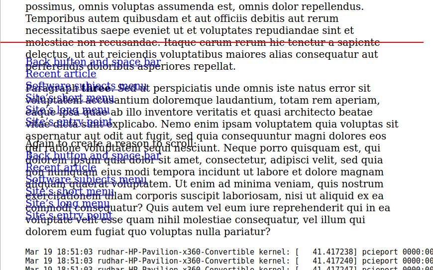
A problem I wasn’t aware of, but was told about on Twitter: when my pages first display, you can’t use the space bar to scroll through them. That works only after you click into the text once.
I never used that function myself, although I knew about its existence from Usenet program Agent, and e-mail program Eudora. There the space bar pages through a message, and at the end skips to the next unread message.
Not only the space bar doesn’t work in my web pages, also to be able to use PageDown, PageUp, and the arrow keys, you must first click into the text.
Compare this
article and this one, where the space
bar does work right away. They have CSS different from most of the
rest of the articles. There is no position:absolute
in there, so the default value position:static
applies. See also
Mozilla.org.
Compare also this demo page that I created. It has the same type of CSS as nearly all the pages in my site, but simplified for clarity. And all the CSS is in the same file as the HTML 5, so the page is self-reliant with no dependencies. The space bar problem can be observed in that one too.
Demo 2 is almost the same,
except that the two blocks are marked position:relative
and position:fixed, instead of both being
absolute. That eliminates the problem: space bar, PgDn,
PgUp, and arrow up and down work immediately, as they should.
Back button
The second problem can also be observed in my Demo 1. Paragraph 1 has a link to
paragraph 5. Click it, then click on to paragraph 6, and back
to paragraph 1. You can repeat this if you want. So far all works
well. You see how the anchor tag changes in the URL address bar
(https://rudhar.com/sfreview/backbutn/demo1.htm#Par05
becomes ..#Par06, then ..#Par01, then
..#Par05, etc.), and you can see the corresponding
numbered paragraphs being displayed.
Now comes the problem: click on the back button of the browser
repeatedly. Most browsers have such a button in the upper left
corner of the screen. The address bar is correctly updated
(..#Par05, ..#Par01, ..#Par06,
..#Par05), but the text content of the page
is not refreshed. Same with the browser’s
forward button.
When doing the same things in Demo 2, you can notice the difference: there it works correctly. Both the URL and the page display are updated at each click, as they should.
Testing environments
I tested my two demos in a variety of environments, recent and older. The behaviour was nearly identical in all cases.
| Operating System (OS) | OS version | Browser | Browser version |
|---|---|---|---|
| Linux Mint | 20.3 Una | Firefox | 111.0 (Gecko) |
| Chromium | 111.0.5563.64 | ||
| Windows | 10 Home, version 21H2, build 19044.2604 |
Edge | 111.0.1661.51, built with Chromium |
| 7 Home Premium, 2009, Service Pack 1 | Firefox | 40.0, Gecko 20100101 | |
| Internet Explorer | 9.0.8112.16421 (2011) | ||
| Vista Home Premium, 2007, Service Pack 2 | Firefox | 52.0.1 (32 bits) | |
| Internet Explorer | 9.0.8112.16421 |
Note: when clicking the back button, Internet Explorer under
Windows Vista did not include the anchors (#Par05,
etc.) in the URL at all. That was the only difference in
behaviour I noticed. Text content was refreshed in Demo 2,
not in Demo 1, the same as in all the other test environments.
Evaluation
I think these are browser bugs. Even if there may be technical reasons for them, this browser behaviour is user-unfriendly. In design considerations, the user should always have first priority (links to articles in Dutch).
However, the fact that in testing in such a wide variety of environments, old and new, the errors occurred consistently throughout, suggests that this is the intended and designed behaviour. In that case in my opinion it is bad design.
Space bar
The extra click is unnecessary. It should just work. User first.
Perhaps the system doesn’t know where to send keyboard input? Because
there are two or three text boxes, all equivalent. My suggestion:
take the <div> that appears in the HTML first.
A practical solution.
Is it a matter of focus? There is the HTML autofocus keyword.
W3’s validator
accepts this code:
<div class=textblok autofocus>
But it doesn’t solve the space bar problem. And indeed the notion
of focus is probably only meaningful with elements like
input, button and textarea.
Adding a button to the top of the text, that does nothing but has autofocus, also has no effect. Even clicking it does not activate keyboard navigation. You must really click into the text itself to make that work.
I also wondered if the z-index could solve it, assuming
the system would send keyboard input to what is lying on top,
if there is a level difference. Test result: doesn’t work, no
effect at all.
By the way, I now no longer test in all seven environments mentioned before, but I restrict myself to Linux Mint with Firefox and Chromium.
Back button
The URL in the address bar should always correspond to the contents displayed! A difference between them confuses the user, a.k.a. website visitor, so that is always unacceptable.
The discrepancy between address bar and visible contents was one
of the objections against frames and
framesets. And now it happens again, or rather:
still! There can be no excuse for this. It is a bug that should
be fixed.
Other people noticing the problem
When looking for a solution, I found several people having the same
or a similar problem. My
search was:
"back button" browser changes address bar does not redisplay .
- Back button isn’t reloading page on ajax site
- How to force reloading a page when using browser back button?
- pushState and back button works but content doesn’t change
- Navigation issue with Browser Back Button Click
- … and many more.
A lot of those people were doing complicated programming with Javascript
and Ajax and such things. Too complicated for me. I largely restrict
myself to static HTML and CSS, with some occasional CGI and SSI.
It seems quite possible that in fact in their cases too, the cause of
the problem was not in their programming, but in the
position and
overflow properties in CSS.
Solutions?
Overflow?
There is a way to make both problems vanish: remove overflow.
(What problems!? Space bar and
back button!) But that causes a new
problem. In the absence of
overflow, or of a separate
overflow-y and
overflow-x, the default applies. That default value
is visible, and it means:
“The overflow is not clipped. The content
renders outside the element's box”. See also
here, where it says:
“The content is not clipped, and it may be
rendered outside the content box.”
Why would anyone ever want that? Why make a box if content spills out of it anyway? The default should be what most people want most of the time. Not what is never useful. Just my opinion and maybe I totally misunderstand.
Anyway, it doesn’t solve my problem. After commenting out
overflow-y and overflow-x, using
/* */, the text from my text box indeed overwrites the
navigation links box, leaving both visible at the same time, making
them both utterly unreadable. How is that a solution for anything?
Just in case other people get different results, or if maybe in future
the problem gets fixed,
 this is
what I get to see.
this is
what I get to see.
And what’s worse: the navigation box now moves along with the scrolling
of the text box. In my opinion that is also a bug. I gave both
boxes, i.e. the class of both <div>s,
the property position:absolute,
which means:
“The element is positioned relative to its first
positioned (not static) ancestor element”.
Both my <div>s are at the same level, not nested,
so they both have <body> as their ancestor element.
They are siblings. So why is my navigation box now positioned relative
to my text box? That cannot be right. But it works like that in both
Firefox (with Gecko) and Chromium.
Is there a value of overflow that IS useful
in my situation? Visible and hidden do not
make sense, because with hidden part of the content
becomes invisible and inaccessible for ever. Scroll
and auto do make sense, but cause the two problems that
this article is about.
Fixed?!
While randomly trying out options, I did find a different approach that
seems promising: instead of making the positions of both boxes
absolute, make the text box static or
relative, and the navigation box fixed.
This is what I have in my
Demo 2.
The letter soup is still there (or was, until I fixed that, see below), but
the navigation box does not move, it now literally stays in
a fixed position, which is fine. Apparently in the browser’s default,
black text on a white background, the white is a transparent
white, unlike when you explicitly specify
background-color: white;
which is an opaque white. Thus it hides the text from the text box,
which – so to speak – slides under the navigation links
box, a bit like
tectonic plates in a convergent boundary.
Another hurdle to be cleared: the vertical left alignment was distorted.
The text in the text box started a little bit more to the right than
the text of the navigation box. Why?? My quick and dirty fix was to turn
position:static into position:relative.
The only difference seems to be that for the latter, the starting
point isn’t implicit, but can be set. I set it to
top:  -8px;

left: -8px;
just by trial and error. Not acceptable as a permanent solution of
course, but it works in this case. Don’t know if it also works in
general, as I have no idea what causes this.
[26 March 2023, 17:20 CEST, all the notes I had, I have turned into sentences with hyperlinks now. Will still look for a more permanent solution.]
Implicit margin
Demo 3 is a copy of
Demo 2, in which I added more
coloured borders, and background colours. This confirmed what I already
half and half suspected: the browser gives the body an
implicit margin of 10 logical pixels. Note that padding is always within
the (possibly invisible) border, while margin is outside it.
In my trial and error solution I shifted the text box by minus 8 pixels. I now see that that was almost right. It should have been -10px.
With the shift and the margin both set to zero, the alignment is also OK.
Apparently a static or relative box is positioned relative to its ancestor,
here the body. An absolute or fixed box is not tied to any
other element, it derives its position directly from the viewport, which
does not have a margin.
The navigation box better have no margin either, because the margin has no explicit background colour, so it is transparent, and deeper text shines through it.
These test results have paved the way to a general solution in my site-wide
basic CSS file textfont.css, so almost all articles in
my site will get the new layout, and no longer have the
space bar and back
button problem.
The end
One last problem (or I hope it’s the last), discovered 27 March:
the end of the article wasn’t visible. When scrolling to the end,
it remained hidden under the navigation box. Solution: add a large
enough padding-bottom or margin-bottom
to the text box class.
The future
[27 March 2023, 23:10 CEST]
Eventually I implemented a way to have text and navigation
centered on the screen, such that it adapts to the width
of the viewport in a much simpler way than before.
I used position:static and position:sticky,
and margin:auto .
See Demo 4, my current textfont.css, and a copy of it in the Way Back Machine.
The present
The present, seen from the perspective of 23 July 2023, is that I do it differently yet again. It’s all explained here.
Copyright © 2023 by R. Harmsen, all rights reserved.